
Most people open Canva, stare at the template library for 20 minutes, and close it without making anything. The tool is free, fast, and genuinely useful. The problem is nobody shows you how to move through it like a workflow instead of a guessing game.
This is for people who already tried Canva once, felt mildly overwhelmed, and want a real system for getting things done fast. Not a tour. A process.
And the process matters more than the features. Canva has hundreds of them. You need maybe twelve.
So here is exactly how to set it up, use it daily, and stop re-doing the same formatting decisions every time you open a blank page.
The Setup Most Tutorials Skip Entirely
Build Your Folder and Brand System on Day One
Every time you skip setup, you pay for it later. Projects get lost. Colors drift. Fonts change for no reason. You end up redesigning from scratch when a duplicate would have taken 30 seconds.
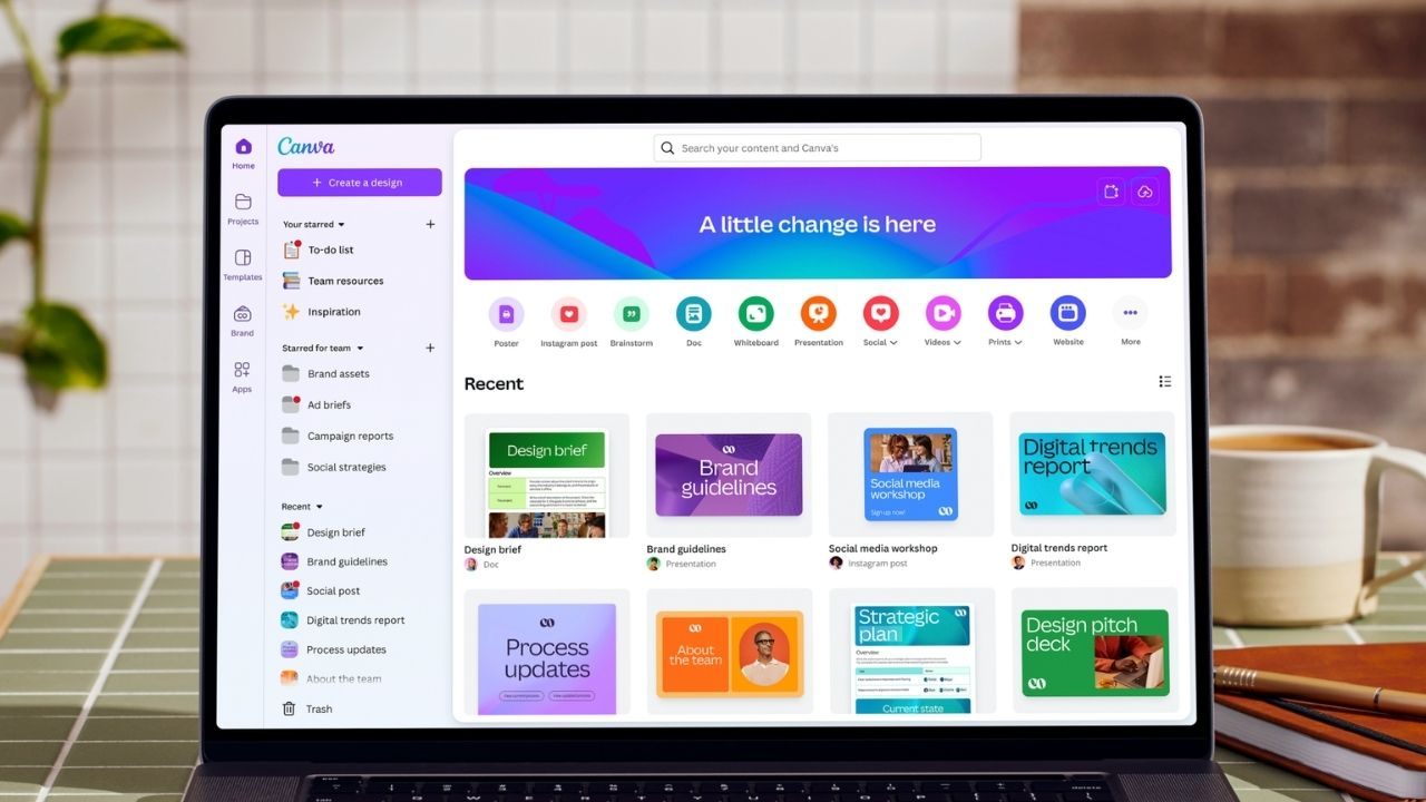
Open Canva and create four folders before you build anything: Documents, Social, Presentations, and Exports. That is the whole system. Anything you make goes into one of those four places.
Then upload your logo. Set two brand colors. Choose one font pairing, one heading font and one body font, and lock it in. Canva’s Brand Kit feature holds all of this so you do not pick randomly every session.
I think the Brand Kit feature is the single most underused part of Canva for non-designers. Most people set it up zero times and then wonder why their graphics look inconsistent across 30 posts.
Keep file names consistent: date, then topic. Something like “2025-05-flyer-pricing” sorts itself automatically and saves you five minutes of searching later.
Name The File First, Design Second
This sounds small. It is not.
Open a new design, rename it immediately, and save it to the correct folder before you touch a single element. Canva autosaves, but unnamed files pile up fast inside “All Projects” and become impossible to find in three days.
Rename first. Design second. Repeat this as a rule every single time.
How To Navigate The Editor Without Getting Lost
Your First Two Minutes Should Follow This Order
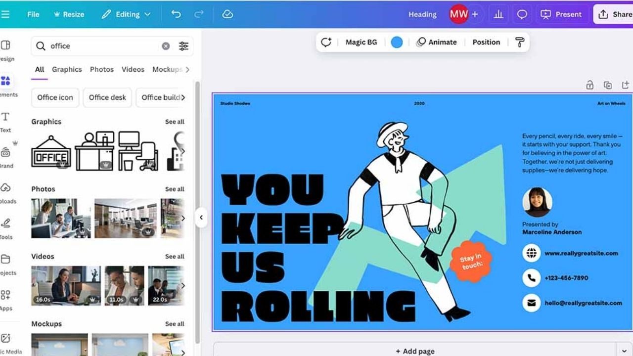
Open the editor and resist the urge to explore everything. The left panel handles templates, elements, uploads, and text. The top toolbar handles font, size, spacing, and position. That is 90 percent of what you need.
Click any element once to select it. Double-click to edit text inside it. Use Ctrl+Z or Cmd+Z constantly as you test changes. Canva’s undo is reliable and you should treat it like a free experiment pass.
Ignore the right side panel for your first session. It exists for advanced styling. Go there only when the basics are locked in.
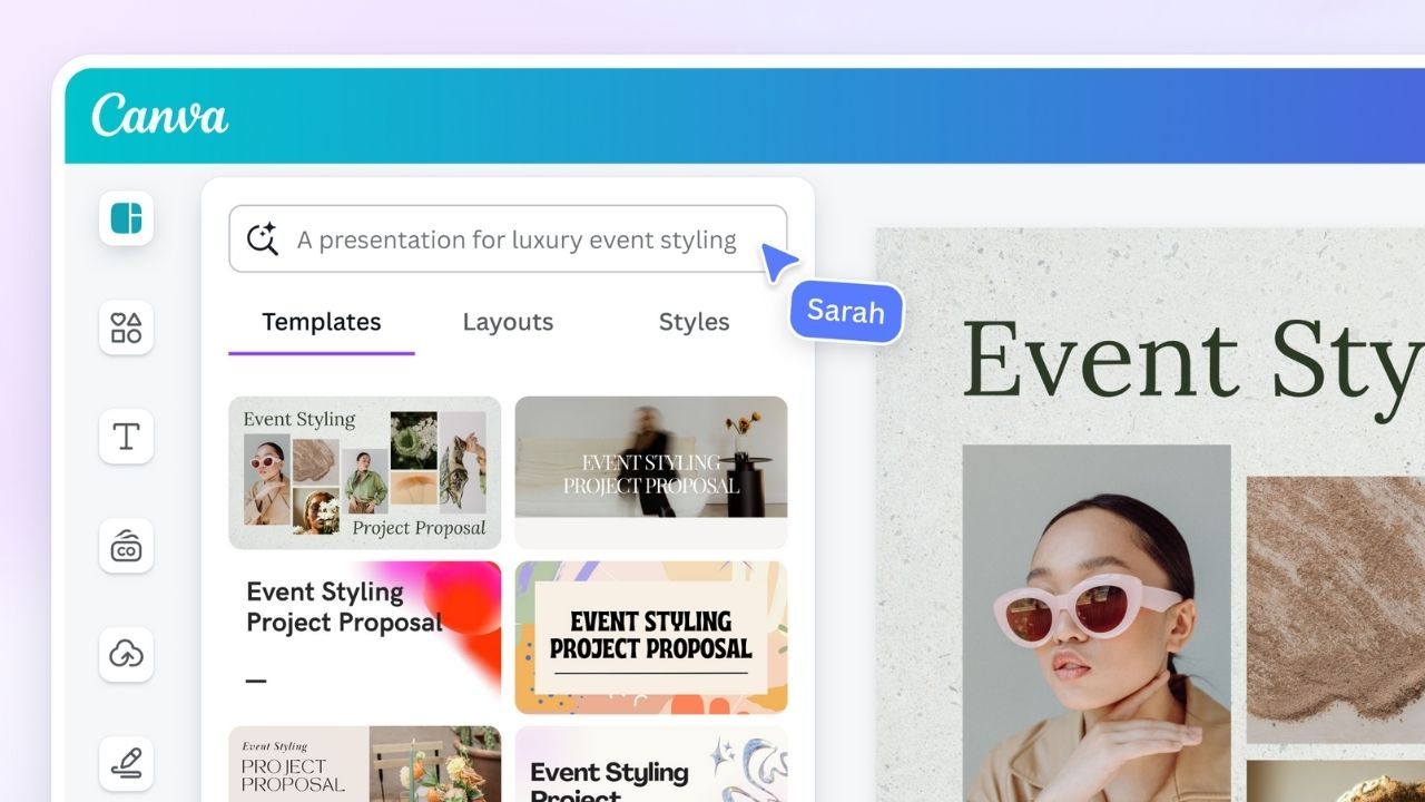
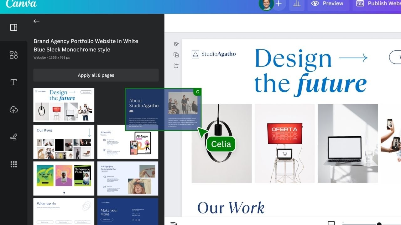
Pick Templates The Right Way
Search by final output type, not by vibe. Type “event flyer,” “price list,” or “weekly schedule,” not “clean” or “modern.” Vague searches return 800 options and none of them feel right.
Filter by color or style once results appear. This cuts the list to something workable fast.
A good template is readable at a glance in the thumbnail view. If it looks crowded in the small preview, it will feel overwhelming when you try to edit it. Scroll past those.
My take: I disagree with the common advice to “just pick any template and customize it.” Starting with a busy, complicated template and trying to simplify it takes longer than starting with a minimal one and adding. Pick the simplest template that fits your content structure. You can always add. Subtracting existing design decisions from someone else’s layout wastes 20 minutes every time.
Check how many pages a template has before you commit. A five-page template for a one-page flyer means you will delete four pages manually, and Canva sometimes carries over unwanted spacing from deleted sections.
Making Documents That Actually Look Professional
Set Page Size Before You Do Anything Else
Choose the design type that matches where the document is going. A4 for standard print. US Letter for forms and North American sharing. Custom dimensions if you are building a PDF guide for email or download.
Flipping orientation after you have already placed elements breaks spacing and alignment. Canva handles resizing, but it does not handle flipping gracefully. Set it first, every time.
Page size controls margins, readability, and export quality. Getting it wrong at the start means fixing layout issues at the end.
Also read: Why You Keep Making the Same Online Form Mistakes Every Single Time
Build Sections Before You Add Graphics
Write your headline and subheads first. Set one body font and one heading font. Establish consistent spacing, same gap between sections, same line height across text blocks.
Add images and icons after your text structure is stable. Graphics placed before text are locked in and always end up repositioned anyway. Do the hard structural work first, then decorate.
Use frames for images so cropping stays consistent. Keep icons from one style set so the page looks unified. Pexels is a solid free option for clean photos that do not look like stock photography from 2009.
Zoom out to check overall balance. Zoom in to check readability. If anything looks crowded, remove content before adding more.
Export Without Losing Quality
| Use Case | Export Format | Why |
|---|---|---|
| Printing | PDF Print | Highest resolution for physical output |
| Email or upload | PDF Standard | Smaller file, clean rendering |
| Social or web graphic | PNG | Sharp edges, no compression artifacts |
| Smaller social image | JPG | Acceptable quality, reduced file size |
The takeaway: match format to destination every time, not just the format you used last time.
Social Graphics That Stay Consistent When You Post Often
Consistency beats creativity for social graphics. A recognizable visual style builds trust faster than any single impressive post.
Pick a platform-specific format first: Instagram Post, Story, YouTube Thumbnail. These sizes have safe margins built in, meaning Canva automatically keeps your content away from edges that get cropped by app interfaces.
Open the Styles panel and apply a preset that matches your brand. Apply your brand colors to accents first, backgrounds second. Two fonts are enough. Any more and the design starts fighting itself on a small screen.
Keep Text Readable on Mobile
Short lines. Strong contrast between text and background. If your background photo is busy, add a semi-transparent overlay behind the text. This is the fastest way to make a noisy image suddenly look polished and intentional.
Check your design at 100 percent zoom. Most people design at 50 percent zoom and miss that their body text is 9 points and unreadable on a phone.
For scheduling posts once your graphics are ready, Buffer integrates cleanly with most platforms and keeps your publishing calendar organized without requiring a separate design tool.
Resize Without Destroying The Layout
Duplicate the page before resizing. Always. Keep the master version untouched so you have a fallback if the resize scrambles your spacing.
After resizing, scan for cropped text, awkward line breaks, and overlapping elements. Canva’s resize feature is good, not perfect. A 30-second check after every resize catches 80 percent of problems before they become someone else’s problem.
Presentations That Communicate Without Decoration
One Slide, One Job
Every slide should do exactly one thing: make one point, show one visual, or ask one question. Slides with three bullet points, a chart, and a logo watermark do not communicate. They create cognitive load.
Pick a presentation theme. Set one title style and one body style for the whole deck. Use repeating patterns, title slide, content slide, and summary slide to keep pacing predictable for whoever watches it.
Whitespace is not wasted space. It is the thing that makes your actual content visible.
Handle Feedback Without Losing Track Of Changes
Share the deck with a view or comment link, not edit access, unless someone specifically needs to make changes. Ask reviewers specific questions so feedback stays focused. “Does slide 3 make the pricing clear?” gets better responses than “let me know what you think.”
Use Canva’s comment thread to track what changed and why. Resolve comments after applying each one. If a layout breaks during an editing session, version history lets you restore a previous state without starting over.
Choose The Right Export Format Before You Share
Export to Canva Present if you are presenting live. It avoids conversion problems and keeps fonts and spacing exactly as designed.
Export as PDF when you want a fixed layout that cannot shift across devices. Export as PPTX only if someone specifically needs to edit the file inside PowerPoint. Do not default to PPTX because it feels safer. Font substitution and spacing shifts make that assumption expensive.
Questions People Ask About Using Canva Daily
Q: Do I need a paid Canva account to use it effectively? The free plan covers templates, basic exports, and most design features. Paid plans unlock the Brand Kit for multiple palettes, background remover, and larger storage. For solo users doing basic graphics, free works well for months before hitting a meaningful limit.
Q: How do I stop my graphics from looking inconsistent across different posts? Set your brand colors and fonts once inside the Brand Kit, then apply that kit every time you start a new design. Inconsistency almost always comes from selecting colors and fonts manually each session instead of pulling from a locked system.
Q: Can I use Canva for print without worrying about resolution? Yes, if you export as PDF Print. Canva renders print exports at 300 DPI, which meets standard print quality requirements. Avoid exporting print-bound files as PNG or JPG unless the printer specifies otherwise.
Q: What is the fastest way to create multiple social posts in the same style? Design one post, lock in your fonts and colors, then duplicate the page for each variation. Change only the text and image. This takes about 90 seconds per post once the first version is done correctly.
Q: How do I share a Canva file with someone who does not use Canva? Export as PDF for a fixed, universally readable version. Export as PPTX if they need to edit it in PowerPoint. For web sharing, generate a public view link from the Share menu so they see it in a browser without needing an account.
Conclusion
Canva rewards people who treat it like a daily system, not a tool they return to once a month, confused. A folder structure, a locked style, and a consistent export habit turn a 45-minute design session into a 12-minute one.
The features are not complicated. The discipline of using them the same way every time is where most people actually struggle. Start there, and the rest gets easy faster than you expect.


