
Using Canva without experience feels less intimidating because the platform is built around ready-made layouts, simple editing tools, and familiar controls.
This guide explains how beginners can create useful designs for social media, documents, presentations, and small business materials without getting lost in advanced design terms.
Canva is most helpful when you need fast visuals and do not have time to learn professional design software from scratch. It works well for people creating posts, flyers, thumbnails, resumes, class materials, menus, invitations, or simple brand assets.
The main advantage is not that Canva does everything perfectly. It is that it helps beginners produce clean work while learning basic design habits along the way.
Why Canva Feels Easier Than Traditional Design Tools?
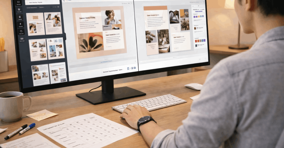
Canva uses a drag-and-drop editor, which means you can move text, photos, icons, and shapes without dealing with complex panels. This makes the first experience feel closer to editing a slide than working inside a professional design suite.
For beginners, that matters because the tool removes blank-page pressure and lets you focus on the message first.
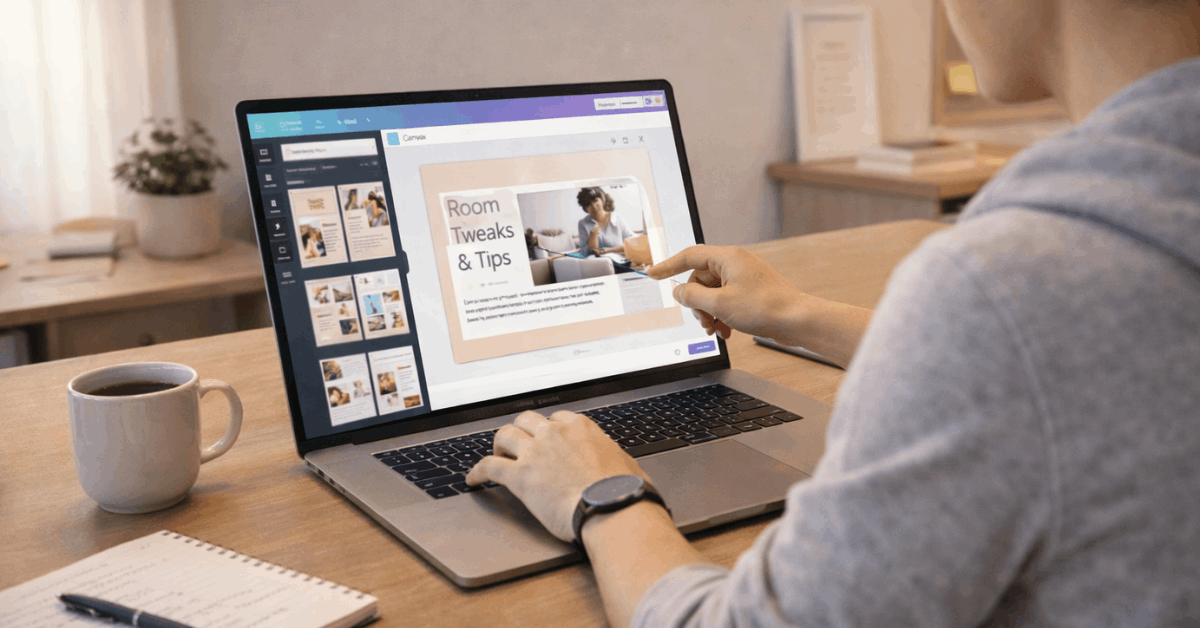
Templates also reduce the number of decisions you need to make at the start. Instead of guessing the correct size for an Instagram post, presentation, flyer, or YouTube thumbnail, you can begin with the format already prepared.
That does not mean every template is ready to publish as-is. It means you get a safe starting point and can adjust the design from there.
Start With a Template, But Do Not Leave It Unchanged
Canva templates are useful, but using them without changes can make your work look too generic. A beginner should treat templates as a base, not as the finished design.
Make Small Edits That Change the Look
The easiest way to personalize a Canva design is to replace the placeholder text with specific wording that fits your real purpose.
After that, update the colors, swap the image, adjust spacing, and remove elements that do not add value. These simple edits already make a design feel more intentional and less like a copied template.
Beginners should also avoid using too many fonts, stickers, icons, and effects in one design. A clean layout usually looks more trustworthy than a crowded one.
If the design is for a business, school project, or professional post, readability should come before decoration. A strong Canva design often depends on clear spacing, simple contrast, and a message people can understand quickly.
Also read: Best Online Tools to Simplify Your Daily Tasks – Productivity Made Easy
Use Brand Elements Carefully
If you are designing for a small business, personal brand, or recurring project, save your common colors, logo, and preferred fonts.
Canva’s brand tools can help keep designs consistent, especially when you create posts every week. Even without a full brand kit, you can still use the same color codes and font pairings across your designs.
Consistency matters because audiences recognize repeated visual patterns. A flyer, social post, and presentation do not need to look identical, but they should feel connected.
This is where beginners can improve quickly: choose fewer visual elements, repeat them with care, and avoid changing the whole style every time.
Learn the Basic Tools Before Using AI Features
Canva includes AI-assisted tools that can help with layouts, text, image edits, and resizing. They can save time, but beginners should still understand the basic editor first.
AI Can Speed Up Work, But It Still Needs Review
Features like background removal, layout suggestions, writing assistance, and image editing can help when you are short on time.
However, AI outputs can still feel off, especially when the text sounds vague or the layout does not match the purpose. Review every AI suggestion before publishing. The final design should still reflect human judgment and the real goal of the project.
Magic Resize can be useful when you need one design adapted for different platforms. A design made for a square post may need changes before it works as a story, banner, or presentation slide.
Always check the spacing, image crop, and text size after resizing. Cross-format design is helpful, but it is not always automatic.
Where Beginners Usually Make Mistakes?
Most early Canva mistakes are not technical. They usually come from overcrowding the design, trusting templates too much, or exporting without checking how the final file looks.
Keep the Design Practical
A design should match where it will be used. A social media post needs quick readability, while a flyer may need contact details, dates, and clear sections.
A presentation slide should not carry a full paragraph if the speaker will explain the idea. Matching the format to the use case helps avoid visual clutter and weak communication.
Use this short check before exporting:
- Is the main message readable?
- Are the colors and fonts consistent?
- Does the file match the right format?
These checks are simple, but they prevent many common errors. Beginners often focus on making the design look attractive and forget that someone needs to read, save, share, or print it. A design that looks good but fails its purpose still needs revision.
Know When Canva Is Not Enough
Canva is strong for everyday design, but it has limits. Complex print projects, advanced photo editing, detailed illustration, layered professional files, or strict brand production may require specialist software or a designer.
This does not make Canva weak. It simply means the tool is best for common design needs, not every design situation.
For commercial work, asset licensing should also be reviewed carefully. Free and paid elements may have different usage conditions, especially for business materials.
Before using premium images, music, icons, or templates in a public campaign, check the current license details inside Canva. This protects your work from usage issues later.
Working Across Devices and With Other People
Canva is convenient because projects stay online and can be opened from different devices. This helps when you need to approve a design on mobile, fix a typo quickly, or continue editing from another computer.
Collaboration Works Best With Clear Roles
Canva’s sharing and comment tools can reduce messy feedback if used properly. Instead of sending several file versions through email, collaborators can leave comments directly on the design. This is useful for teams, clients, classmates, and small businesses that need quick reviews.
Still, shared access should be managed carefully. Not everyone needs edit permission. Some people only need to view or comment, especially when the layout is already approved.
Clear permissions protect the design from accidental changes and keep the review process more organized.
Conclusion: Canva Works Best When You Keep It Simple
Canva can help beginners create useful designs without formal training, but the best results come from simple choices, not from using every feature.
Start with a relevant template, customize it with purpose, check readability, and review the final file before sharing or publishing.
Using Canva without experience becomes easier when you treat the platform as a practical design assistant rather than a shortcut for every creative decision.
Keep your layouts clean, use AI carefully, confirm licensing when needed, and build consistency over time. That approach makes Canva more than a beginner tool; it becomes a reliable part of your everyday workflow.


